Thursday, 6 October 2011

Photography- The lovely Chesterfield College...

When using photoshop I managed to change what was a to be honest a pretty dull photograph in terms of colour to this slightly more brighter and colourful image. Where as the image before was just a plain blue by editing it I managed to create an effect similar as to if the sun was shining upon it.


Wednesday, 5 October 2011

Hepworth Wakefield Gallery...

The Sculpture Black Cloud by Heather and Ivan Morison, is a towering wooden pavilion inspired by the amazonian dwellings of the Yanomamo tribe. Constructed using the Amish principles of communal participation, it is protected from the elements by an ancient Japanese scorching technique. To be honest I'm not really sure how I feel about this piece.
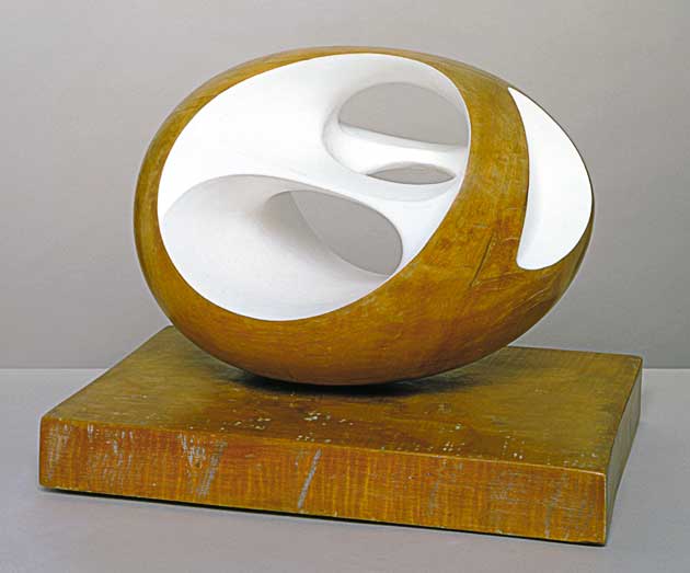
This is an image of one of the sculptures created by Barbara Hepworth and with an enormous amount of respect, her work in my opinion I just don't really like. Although I agree that the finish to the piece is obviously done skillfully the overall piece I just feel is simple and uninspiring.
This is an image of the floor that the sculpture Black Cloud sits on and I just really liked how the circle pattern overlapped and cuts off the other individual squares. I also like the colours and the way in which the colours are separated.
I unfortunately didn't note down the name of the artist who created this piece but i did like it. The individual strands which make up the ball don't seem to have an even width or neatness to them which I like and they almost look quite careless as if not much effort has been put into them, however I'm sure it has. Furthermore the occasional use of colour throughout the piece just makes it overall a lot more friendly and pleasant. 


Photography/Theory- Kedleston Hall...

This image is actually of the statue of the lion in the grounds of Kedleston Hall; taken just from behind of the statue. I'm not certain as to why I decided to take the photograph but when I took a number I found that I liked it more than some of my others. I also liked how the tree in the background is slightly cut off due to it being behind the statue and the negative lines/space created by the statue and tree I like. I guess its the close up of the rock and the wet texture I like.
An image of one of the trees again in the grounds of Kedleston Hall. With this photograph I basically tried to focus the camera on one of the branches and have the rest blurry attempting to create a nice contrast between the two. Thinking about the negative space in the photograph once again, I think on the left side of the image with the light coming through the branches it creates an interesting effect, as if its fuzzy and distorted by the light. I also tried to make sure that the focused branch was in the center of the image as to attract attention and focus. 
A photograph of Kedleston Hall itself from outside. The actual architecture of the building, the statues, columns and patterns I found one of the most interesting features of the visit and I also loved the stairs outside: I'm not sure why exactly but I did really like them. I guess with this photograph I tried to make one of them quite challenging, bold images showing the size of the image however it didn't come out as I wanted it to. 
A close up photograph of a statue and what I tried to achieve and do with this image was to have it touching the the edge and to have the main object taking up a lot of the photograph. Also the light next to the image appears to have quite a bright and strong quality one in which I didn't actually aim to capture. With the close up this also allows the colours and pattern or difference in texture whatever it is on the cheek to be visible which  quite like. I think I might have already said it but I think the composition of the piece works well as well.


Monday, 26 September 2011

Photography- The streets of Chesterfield...

What I really liked about Chesterfield and our little trip out was that there seemed to be quite a lot of elderly people around town and especially the market place. The posture, facial expression and clothes all seem to appeal to me rather than that of the clothes worn by the younger generation. I took this photograph blind and considering that I think the angles created from the buildings and the main focus of the piece being the elderly couple works well.
Throughout my journey to town I found myself walking around and searching for what I felt were good images to be taken however, with the image it seemed to simply present itself to me whilst sitting on a bench, whilst I was focusing on another possible photograph.
Again this photograph was taken blindly and from just a quick glimpse what attracted me to the image was the angle of the buildings and the way in which they seem to                   surround and almost point towards the woman in the center of the photograph.
The actual content of this photograph is what I found most interesting, the idea of people searching through a skip I just liked it. 

Sunday, 18 September 2011

Photography- William Eggleston, Martin Parr and Joel Meyerowitz...

Out of William Eggleston's collection of photographs this is the one I decided to focus my attention on. One feature that I find stands out about the photograph is the colours included in the image and how the strong red from the drink contrasts the light, subtle colours of the aeroplane's interior. I also think that as the photograph is taken from the inside of an aeroplane that that in itself also contributes to the photographs uniqueness. The shadow created from the glass I also think gives a slightly simpler image when compared to the realism of the overall photograph. With the photograph also avoiding mainly sharp and strong lines the image's theme appears, to me at least to be soft and tranquil. I can't help but also feel that where as I normally associate flight journeys as horrible, cramped events, this picture seems to show the opposite to that idea and whether it just being the hand position but this flight seems enjoyable. 


One thing I have noticed about Martin Parr's work is that although it may just be random, a lot of his pieces seem to focus on a pleasant environment such as a beach or landscape and then the images tend to include a tourist like individual as the main focus, not necessarily effecting the photographs quality but giving it a unique style. The photograph I also feel has a slight comical feel to it and is also of an image that is recognizable to most tourists/Brits.


In this photograph one of the features I really liked was how the artist has managed to capture an image where the colours such as the red and yellow on the street signs and the black of the buildings seem to be faded and almost dull. This appears to continue even throughout the peoples clothes; the only exception being the sky in my opinion that is. Again I really like the business of the photograph and the movement of the image as the people walk past. I also like how below the skyline the image appears to be quite dark due to the shadow and business of the piece and in contrast to the empty, lighter sky it creates an amusing picture.