So Thorsten Brinkmann's artwork basically resides of him redressing people mainly women in clothes putting say a bag on the head or trousers on the arms. As you can see in the photograph the subject is wearing what appears to be a leather bag on her head and a cardigan the wrong way round. I think everything about this piece is perfect, it seems to me to have a slight eighteenth, nineteenth century theme with the image being taken from the side. The colours of the items of the clothing are also interesting as they avoid any bright colours and seem to vary around quite dull almost faded colours which I like. Moreover although the clothes in the image are in a way wrong as in how they are being worn the piece still seems to make sense and is still easy to determine which position the subject is facing and what it actually is. An absolutely brilliant piece in my opinion I feel like its wrong, yet it looks right.
Another amazing piece by Thorsten Brinkmann: now after seeing this piece and and a few others I feel pretty certain in assuming that the artist goal when creating his pieces is to create a eighteenth century portrait with a hint of surrealism in it and modernism of course. After looking at the headdress I'm still uncertain as to what it is. At first I just assumed it was another bag after seeing the first image but when I looked harder it, in opinion resembled the paper you get your chips in at a fish and chip shop however, I then went back to my previous idea due to the surface having what looked like a shine to it. The pose once again I think helps resemble a portrait from the past, as if it is of someone royal perhaps. Again I think the use of colour in this piece is very interesting; this piece differs from the previous as the subject is completely light in contrast with the black background allowing the audience to focus on the individual.
Out of all of Brinkmann's pieces this piece is my absolute favourite. The section regarding the head, I like more than the other pieces simply due to the shape; the smooth outline of the what I think might be a tennis racket case and the nose of the model slightly protruding creating just a slight amount of shading to make it obvious what it is. Moving down the image the doylees or whatever they are taking on the role of what I think is called a lapel, its so simple, merely resembling a similar upside-down triangle shape yet its recognizable. The backwards facing jacket I also think fits perfectly. The green, brown, gold mix and the folds, even how the upper part of the chest stands out more than any other part of the torso. Finally the milking jug on the hand I think is just amazing but, I'm not really sure why I like it so much. The overall pose of the subject when looking at it as a whole I also think has been created in a perhaps modern style, as if the subject is looking at you, the surreal aspects again I think. After actually looking at this artist and evaluating his work, deciding what I like and dislike his artwork has really made me change my view on what I consider to be fine art. From normally only really, seriously liking art mainly created with pen, pencil or paint this artwork has really opened me up to accept and to explore other artists besides those using the traditional medium.
Monday, 7 November 2011
Erwin Wurm...
Discovering this artist today my overall opinion of the artist and his work is generally positive. I think that this piece specifically works really well as a whole. The simplicity of the piece being really just a bag on a person's head I really like but when I looked closer the stage and what I think are tennis balls I think help the piece as well. Furthermore the piece I think has a surreal aspect to it which is one of my favourite types of art.
Following on from the surreal nature of his pieces I think this piece demonstrates that exactly to an extent. The angle of the woman's body coming down slightly from the right and eventually getting larger at the bottom, it just works, its a great pose. With it getting larger it also sort of contrasts with the sharp, thin pointy pencils she's obviously about to sit on. I like the colours as well the neutral, non vibrant tones of the woman's dress, skin colour and even the background of the piece and the slightly brighter more vibrant colours of the pencils are lovely.
One thing that my lovely teacher (Andy) told me about this piece is that to create it the artist set up two buckets and said "stand in one of the buckets and put the other on your head." Therefore depending on how the individual stands, sits or crouches even the pose and overall image will be different, suggesting that the form of the person or stance is the actual artwork rather than the obvious bucket on the head. What I like about this piece of art however is how its almost like people who don't do art perhaps are actually helping creating these interesting pieces and with such ease. So overall I think that this artist is really interesting, I really like his slightly surreal approach and how with some pieces he even gets the viewers of his art actually in the art. Although its a small part of his art I also like how he actually presents his work, the colours, the poses of the primary subjects, the little raised stages: I just like it.
Following on from the surreal nature of his pieces I think this piece demonstrates that exactly to an extent. The angle of the woman's body coming down slightly from the right and eventually getting larger at the bottom, it just works, its a great pose. With it getting larger it also sort of contrasts with the sharp, thin pointy pencils she's obviously about to sit on. I like the colours as well the neutral, non vibrant tones of the woman's dress, skin colour and even the background of the piece and the slightly brighter more vibrant colours of the pencils are lovely.
One thing that my lovely teacher (Andy) told me about this piece is that to create it the artist set up two buckets and said "stand in one of the buckets and put the other on your head." Therefore depending on how the individual stands, sits or crouches even the pose and overall image will be different, suggesting that the form of the person or stance is the actual artwork rather than the obvious bucket on the head. What I like about this piece of art however is how its almost like people who don't do art perhaps are actually helping creating these interesting pieces and with such ease. So overall I think that this artist is really interesting, I really like his slightly surreal approach and how with some pieces he even gets the viewers of his art actually in the art. Although its a small part of his art I also like how he actually presents his work, the colours, the poses of the primary subjects, the little raised stages: I just like it.
Sunday, 9 October 2011
History of Your Life in 4 Objects/ Childhood...
Baby Shoes. My baby shoes are originally from Canada according to my mums cousin. The reason they came into my possession is that before I was born they were given as a present to my parents. Apparently bought form a stall rather than a shopping complex of some sort the shoes are obviously not mass produced but produced on a smaller scale, maybe even handmade. Strangely enough for some reason I never wore these shoes because well I had another pair apparently and there was just no need. As the shoes were from my first few weeks as a child I really have no memories regarding them. I thought they might be relevant as my second object follows onto footwear as well and I thought seeing the change might have some significance.
Saturday, 8 October 2011
Theory- Damien Hirst Exhibition...
What I have noticed about Damien Hirst's work is that I find myself liking the ideas he comes up with however I find his work lacks the touch of the artist. In particular the animals he puts in glass as I don't think he personally does it himself but someone else, which makes me think that he isn't actually creating the pieces.
To be honest I thought it would be relevant to include a piece of art by Damien Hirst that isn't a sculpture. I personally think that the piece although slightly interesting considering the colour and the way in which it is used isn't what I really like. The piece looks as if it could have been created on the computer and considering the form I can't imagine it took a lot of skill to create. However I could be wrong so I apologise if I am. What I do like about the piece however is the size; I think it covers an entire wall its huge which I think adds to its impact on the viewer.
Now although I don't like Damien Hirst's work that much mainly due to him not actually creating the pieces himself I feel although this piece may have been created in a similar way the idea and final product is that good it doesn't bother me if he's created it or not I just like the piece.
Theory- The Leeds Gallery...
Lady Elizabeth Butler- Scotland Forever. Out of all the paintings and sculptures that were on display this painting is by far my favourite. When looking at the photograph you don't get the same effect as when looking at the piece in person. From a distance the piece looks so real and so well painted and then if you take a step closer the piece suddenly doesn't look as real but a lot more like a painting with the brush marks becoming visible.
Leon Richet's paintings stood out to me at first due to their size and attention to detail. Although I'm not normally a fan of landscapes but I can't help but be amazed amazed by this artists work and with this piece in particular the contrast of the warm yellow sunlight behind the dark trees creates an amazing effect and is accomplished with such skill.
Phillip Hermogenes Calderon- Her most High, Noble and Puissant Grace. The skill of this painting is truly one of the best in the Leeds Gallery I think. The textures of the cloth, silk, metal of the trumpets, its so realistic and so skillful. Overall I think Leeds Gallery is the best I've seen so far with some truly amazing artwork.
Leon Richet's paintings stood out to me at first due to their size and attention to detail. Although I'm not normally a fan of landscapes but I can't help but be amazed amazed by this artists work and with this piece in particular the contrast of the warm yellow sunlight behind the dark trees creates an amazing effect and is accomplished with such skill.
Phillip Hermogenes Calderon- Her most High, Noble and Puissant Grace. The skill of this painting is truly one of the best in the Leeds Gallery I think. The textures of the cloth, silk, metal of the trumpets, its so realistic and so skillful. Overall I think Leeds Gallery is the best I've seen so far with some truly amazing artwork.
Yorkshire Sculpture Park...
To be honest I liked nearly everything about these two sculptures. I think its just the idea behind them, the fact that they are giant rabbits, its brilliant. The material, pose and it being cut in half I think is unique and gives the entire sculpture a slight surreal effect.
I wasn't a huge fan of the actual sculptures in this specific dark room however I did think the way in which the artwork was on display was really interesting as they came off the wall.
Again I have a similar opinion about this piece of art as I did to the other room and to be honest I dislike this piece even more than the other sculpture. Recently discovering that the heads aren't even crafted by the artist but instead carved using a variety of scanners and lasers makes the piece even less appealing to me.
To be honest I don't have that much to say about this piece except that liked it a lot, the facial expression, colour and it having a sort of rough, uneven texture I just found interesting.
Thursday, 6 October 2011
Theory- The Millennium Gallery- John Martin...
Martin's dramatic images have inspired everything over the years from sci-fi films to heavy metal album covers. Yet, compared to contemporaries like Constable and Turner, he was largely snubbed by the establishment of his day- John Ruskin was a particularly vocal critic! Instead, Martin developed his audience from the grass roots- relying on an eye for enthralling subjects and tireless touring of his paintings to build his popularity.
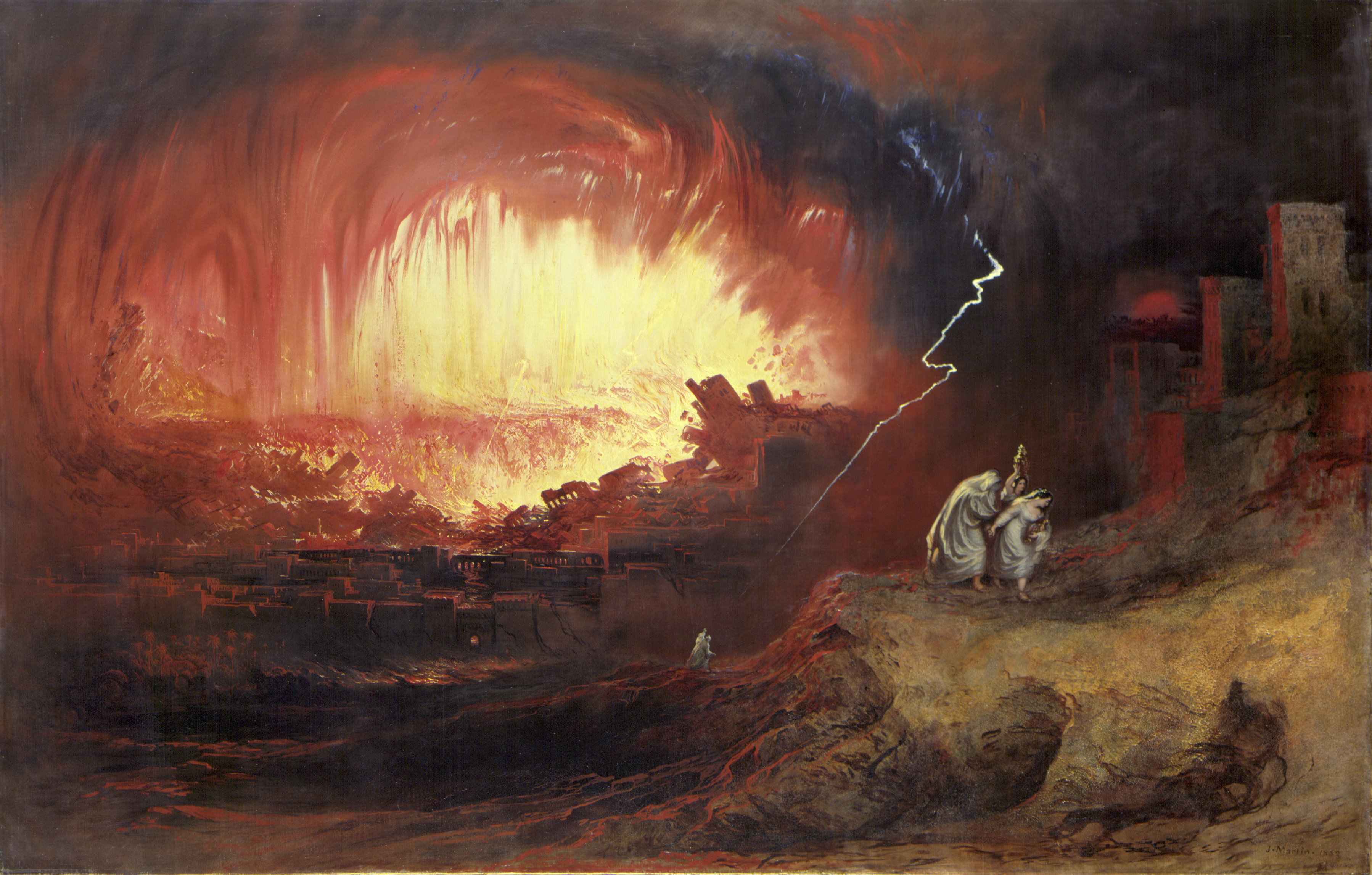
The destruction of Sodom and Gamorrah:- Firstly the reason why I do not have my own photographs of this exhibition is due to the fact that the gallery would not allow anyone to take photographs so I had to get my own photographs off the internet. Anyway I found the gallery really interesting when I first saw his work. These three paintings in particular
The great day of his wrath. stood out to me due to their sheer size and just powerful appearance. The images I also feel considering when they were painted are in my opinion ahead of their time- the idea of collapsing buildings and end of the world thoughts although quite common nowadays I imagine they wouldn't have been in the seventeen and eighteen hundreds.
Getting back to the size of these three pieces, they are enormous, bigger than ten feet in height and width and I think with the pieces being about the end of the world the fact that they are so big just make them so much more dramatic and effective. Another feature like about Martin's are the thunderous crag-like clouds which are slightly ambiguous and is actually difficult to determine what is what in his pieces. With the landscape and apocalyptic themed pieces the uncertainty and almost mess/clash of colours and land makes sense in an end of the world piece of art.
Adam and Eve Entertaining the Angel Raphael:- This painting is based on Books V to VII of Milton's Paradise Lost. At the far right Adam and Eve receive the Angel Raphael who cautions them against disobeying God's command and warns them of Satan's plan to bring abut the Fall. The terrain descends dramatically to reveal a panoramic vista of Paradise a visionary landscape of luxuriant growth. This is nature at its very birth, in a primal state of innocence before its corruption by man. I think that out of all of Martin's works that this piece is by far my favourite and I think this because whereas his other works are mostly dark, ambiguous and rarely have form, this one piece is of an actual landscape and the bright blue and green tones are a nice change from back and red. The theme of the piece and detail considering the size I think is also amazing and when I imagine the amount of time and dedication it must have taken to create such a piece, I just have so much respect for the artist.
The destruction of Sodom and Gamorrah:- Firstly the reason why I do not have my own photographs of this exhibition is due to the fact that the gallery would not allow anyone to take photographs so I had to get my own photographs off the internet. Anyway I found the gallery really interesting when I first saw his work. These three paintings in particular
The great day of his wrath. stood out to me due to their sheer size and just powerful appearance. The images I also feel considering when they were painted are in my opinion ahead of their time- the idea of collapsing buildings and end of the world thoughts although quite common nowadays I imagine they wouldn't have been in the seventeen and eighteen hundreds.
Getting back to the size of these three pieces, they are enormous, bigger than ten feet in height and width and I think with the pieces being about the end of the world the fact that they are so big just make them so much more dramatic and effective. Another feature like about Martin's are the thunderous crag-like clouds which are slightly ambiguous and is actually difficult to determine what is what in his pieces. With the landscape and apocalyptic themed pieces the uncertainty and almost mess/clash of colours and land makes sense in an end of the world piece of art.
Adam and Eve Entertaining the Angel Raphael:- This painting is based on Books V to VII of Milton's Paradise Lost. At the far right Adam and Eve receive the Angel Raphael who cautions them against disobeying God's command and warns them of Satan's plan to bring abut the Fall. The terrain descends dramatically to reveal a panoramic vista of Paradise a visionary landscape of luxuriant growth. This is nature at its very birth, in a primal state of innocence before its corruption by man. I think that out of all of Martin's works that this piece is by far my favourite and I think this because whereas his other works are mostly dark, ambiguous and rarely have form, this one piece is of an actual landscape and the bright blue and green tones are a nice change from back and red. The theme of the piece and detail considering the size I think is also amazing and when I imagine the amount of time and dedication it must have taken to create such a piece, I just have so much respect for the artist.
Subscribe to:
Posts (Atom)